• Home
  • My Story
  • Gallery
  • Food Blog
  • Suggestions
"Time to eat smart."

Food Blog

Food For Thought: How the Food Industry Influences Consumer Behavior

7/20/2019

4 Comments

 
When you walk into a supermarket, you are surrounded by thousands of options, yet you only choose a fraction of what's presented to you. What do you find most appealing about the products that end up in your cart? Maybe you don't know, and if you think you do know, chances are there are many more factors that are pulling you in than you are aware of. The food industry is particularly clever. Every single decision made -- from grocery store layout, colors used in packaging, a brand logo, etc. -- is meant to pull you in a specific direction.

Every decision made in the food industry, even in grocery store layout, however minuscule, has an impact on what you buy and how much of it. For instance, have you ever considered how most grocery stores have the entry doors on the right side? Think about it. It's weird, right? Maybe it's a coincidence. Although, research shows most shoppers prefer to shop in a counter-clockwise fashion, which is why grocery store entrances are normally on the right and checkout counters are normally on the left. This example -- along with many others -- shows how we can be subliminally swayed in food-based decisions. Stick with this post to uncover some of the ways you are being persuaded that you likely are not aware of so that you can become a better informed consumer, and save time and money.

What was your last impulse buy, and why did you purchase it? 
Comment below!

The Psychology of Supermarkets

Most people arrive at the grocery store with a list of items you need, however almost all of us are guilty of normally walking out of the store with additional items that we want. Why? What prompts us to spend more money? How do these grocery stores draw us in to not solely buy what is necessary?

After some research, I was shocked by all of the subtle ways in which grocery stores alter their appearance. From the time you enter the store to the time you exit, many aspects of layout and atmosphere are controlled to seduce you into buying things beyond your original intentions.

Below are some of many ways in which your shopping experience is often designed to motivate you to spend more money. Hopefully, after being exposed to their methods, you will be able to save time and money by sticking to your grocery list to only buy the essentials.

The entrance - Did you know that most shoppers gravitate towards shopping in a counter-clockwise direction? This is why, as you may notice, the vast majority of supermarkets have the entrance on the right and the exit on the left. This is to ensure you are exposed to as much of the store as you can since you naturally move in that direction. It's easier to lose yourself and sense of only purchasing the essentials that way.

The shopping carts - Even the size of a shopping cart, which has become bigger over time, has an impact on our buying habits. According to Martin Lindstrom, doubling the size of a cart leads consumers to buy 40% more on average! A bigger shopping cart encourages you to put more in it, after all.

The first impression - Oddly enough, when you first walk into the supermarket, what you will almost always see is the produce, baked goods, and/or floral sections. Why is that? Well, the delicious scents and the healthy, fresh, colorful sights apparently draw us in to the store and beckon us further into its depths. Creative!

The lighting - Lighting in grocery stores is often bright to make us feel as if we are in a more upbeat, safer atmosphere. Plus, ever notice how most supermarkets have few windows or skylights? This makes a shopper more likely to lose the external cues that indicate passage of time, causing them to linger in the store longer and buy more items.

The convenience - Think of your typical shopping list. It probably includes at least one dairy item, right? Well, grocery stores know that, so intentionally often put the dairy section as far from the entrance as possible. This is so that you have to walk through more of the store and be exposed to more items on your way.

The product placement - Similarly, popular items are usually placed in the middle of the aisle so you have to pass more products before getting to what you need. This increases your chances of buying something outside of what you intended to when you first walked in. Additionally, supermarkets are smart in their placement of kids items at kids' eye level so they are more likely to see them and beg their parents to buy them. Furthermore, more expensive items are placed at adults' eye level so they are more likely to see them and buy on impulse than the cheaper items they would have to crouch down to examine and pick up.

The checkout - Perhaps a more obvious means of enticement, the vast majority of grocery stores include an array of more products at checkout even when you have already decided that you are done shopping. The reason this succeeds in you spending more of your money is that these items are typically both inexpensive and compelling taste-wise - normally gum and candy - so that you are likely to think to yourself, Why not? What's an extra dollar or two compared to what I've spent already? Plus, what could a small thing of candy hurt? However, this extra dollar or two can add up with every visit, and it is another dollar or two out of pocket.

Clever Logos - Subliminal Advertising

There are hidden messages and pictures in dozens of food company logos, and most of them you probably have never noticed. While we may not consciously process them, these subliminal messages may be subconsciously processed to help shape our overall impression of a brand. Below are some examples of how popular food brands hide pictures in their logos and packaging.
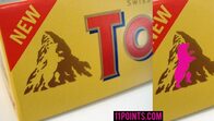
1. Toblerone
Picture
That isn't just a mountain - this popular candy bar features a dancing bear inside of it. This is most likely to represent nature, and fun and excitement.

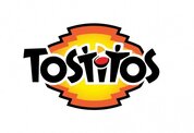
2. Tostitos
Picture
If you look closely at the 4th, 5th, and 6th letters in Tostitos you will notice that the "i" is a bowl of dip and the two "t's" are people sharing a chip. This is likely used to show that Tostitos are a fun snack to share and enjoy with friends.

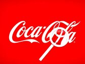
3. Coca Cola
Picture
This one is less obvious, but if you look between the "o" and the "l" in "cola" you will see the danish flag, which may have invoked unconscious patriotic feelings when the brand campaigned in Denmark.

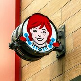
4. Wendy's
Picture
After a closer look at the girl's shirt collar, you can see the word "mom" hidden. This is likely to reinforce the idea that Wendy's is an honest, family-friendly restaurant.

5. Baskin Robbins
Picture
This one you may already know about as it's a bit more obvious, but if you only pay attention to the pink portion of the "BR" it spells out 31. This signifies the fact a Baskin Robbins typically has 31 flavors, emphasizing the many flavors it has for you to choose from.

Compelling Advertising Methods

Not exclusive to the food industry, all advertisements follow a very strict game plan as to how to best draw consumers in and persuade them to buy their product. There are various strategies that marketing specialists use to make a product seem more appealing. After reading the tactics listed below, hopefully you will be able to see past peripheral influences and judge whether to buy a product by its true core message.

Celebrities - While perhaps more common in the beauty industry, food industry companies like Pepsi often utilize famous individuals to promote their products and messages. This is because we trust reputable celebrities and view them as role models, so we are more likely to listen to what they have to say.

Professionals - Oftentimes the people featured in advertisements or packaging are dressed up to look like doctors, businessmen, or other professionals.  This makes you more likely to buy the product because, like celebrities, people with seemingly high intellect appear more trustworthy to the consumer. Thus, they are more likely to adhere to the actor's advice to buy the product because of whatever reason, and be less likely to question their judgment.

Good times - When people are smiling in an advertisement, mirror neurons in your brain are activated which makes you smile a little too, and mimic them. And, believe it or not, smiling can actually make us a bit happier since feel-good hormones like serotonin, endorphins, and dopamine are released. So, when we see people in advertisements having a good time sharing food or a drink, it actually lifts our spirits. And because we associate the product with a positive mood, we are more likely to warm to the possibility of purchasing it. Cool, right?

Transformation - Especially common in foods promising weight loss, the transformation method involves a before and after picture/description that shows how someone is transformed by using the product. Don't be too impressed too easily, though, since you never know if the company is exaggerating through photoshopped pictures or people who are actors that did not actually consume the product. Please do your research before trusting the results you perceive.

Risk-free - This strategy frequents alcohol advertisements and ads for food that may have a negative impact on the body. Advertisements may gloss over the negative impacts of a product, which is usually saved for the fine print on the back, instead favoring for a face image that highlights only the good qualities. Again, do your research to find out the risks of consumption instead of trusting what the packaging promises on the surface.

Bandwagon - This is used very frequently, and is often implied in slogans. The bandwagon method is to basically convey that if you do not buy the product, you are missing out because everyone else is trying it. This appeals to our inherent need to belong in a group.

Masterful Use of Colors

Believe it or not, colors are carefully selected to shape your overall perception of a brand. The index below shows what marketing specialists are influencing you to feel or think by looking at the color of packaging.

Black, silver, gold
The product is a luxury item

Neon + black
Energy, innovation

Pastels
Spiritualism, cleanliness, neatness

White
Simplicity, perfection

Pastels + white
Health, sophistication

Bold colors
Kid-friendliness, excitement, creativity

Greys, blues, whites
Productivity

Red
Hunger, danger, love, passion

Orange, yellow, brown
Fun, inexpensive

Green, brown
Nature, wellness

Blue
Trust, stability, peace

Purple
Success, imagination, wisdom, ambition
4 Comments

    Jessica A.

    A high schooler with a love of food. See the My Story page to find out more.

    Archives

    June 2021
    March 2021
    January 2021
    December 2020
    November 2020
    October 2020
    September 2020
    August 2020
    July 2020
    May 2020
    April 2020
    March 2020
    January 2020
    December 2019
    August 2019
    July 2019
    December 2018
    September 2018
    August 2018
    June 2018
    May 2018
    April 2018
    March 2018
    September 2016
    August 2016

    Categories

    All

    Excited to be notified of future posts? Subscribe here!

    * indicates required

    RSS Feed

Email me at jessica@timetothinkfoodsmart.com to let me know what you think!
  • Home
  • My Story
  • Gallery
  • Food Blog
  • Suggestions